FlySFO
Reimagining the airport navigation & COVID-19 testing experience for SFO users.
Overview
Learn a little about us, some background information for this project, and a sneak peek at our design process in this section.
Project Duration
April 2022 - June 2022
Team
Das Liao, Sally Kim
Project Type
Group Course Project
My Role
UX Research, Prototyping, Human-centered Design
Project Background
Ever since the start of the COVID pandemic and the country-specific requirements for testing prior to flights, many expressed concerns and frustrations before boarding their plane.
We focused on SFO as our “client” to narrow down the target audience and curate our design solutions.
The Problem
Country-specific COVID regulation prior to flights raise concerns and frustrations of the flight preparation process. As a result, the passengers experience excessive stress at the airport, making the overall experience at SFO a negative one.

Design Process
Our design process was divided into four major parts. Within each part, however, we constantly interviewed real users and got feedback for our design to ensure that we were designing for the users.
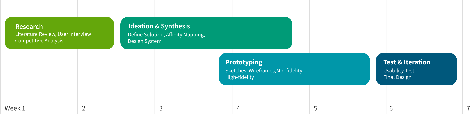
Research
Learn about the research that we did in order to put the users first. We learned so much through empowering our users' voices!
Literature Review
With the topic in mind, we looked at internet forums and sources to painpoint and define the problem space within the topic of flights through SFO post-COVID.
Here are the findings
People are already stressed by the process of preparing for a flight. The negative feelings have been exacerbated after the start of the pandemic.
Many people are lost, confused, and stressed by the myriad of complex regulations for entering and leaving countries during trips.
Finding amenities and places within the airport also add onto this stress for people.
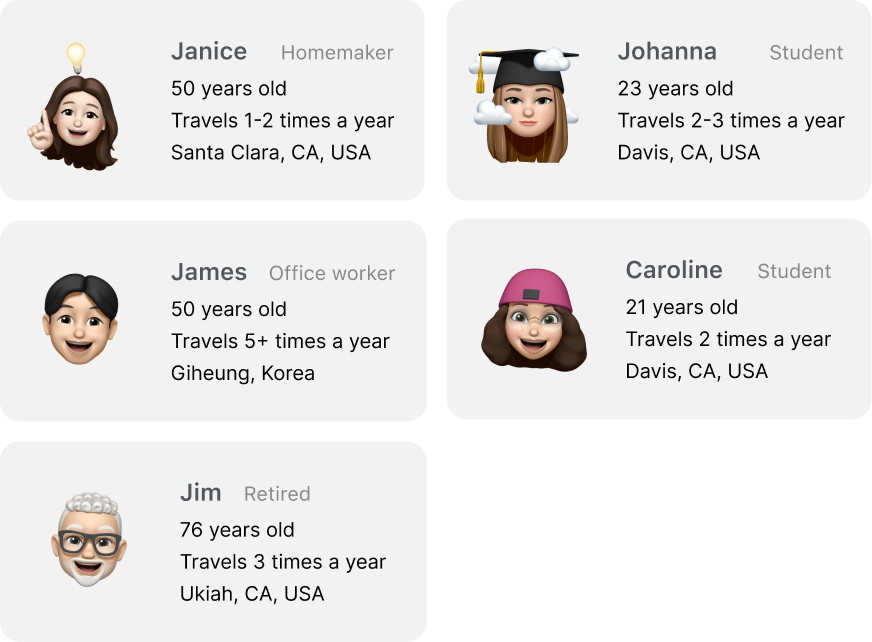
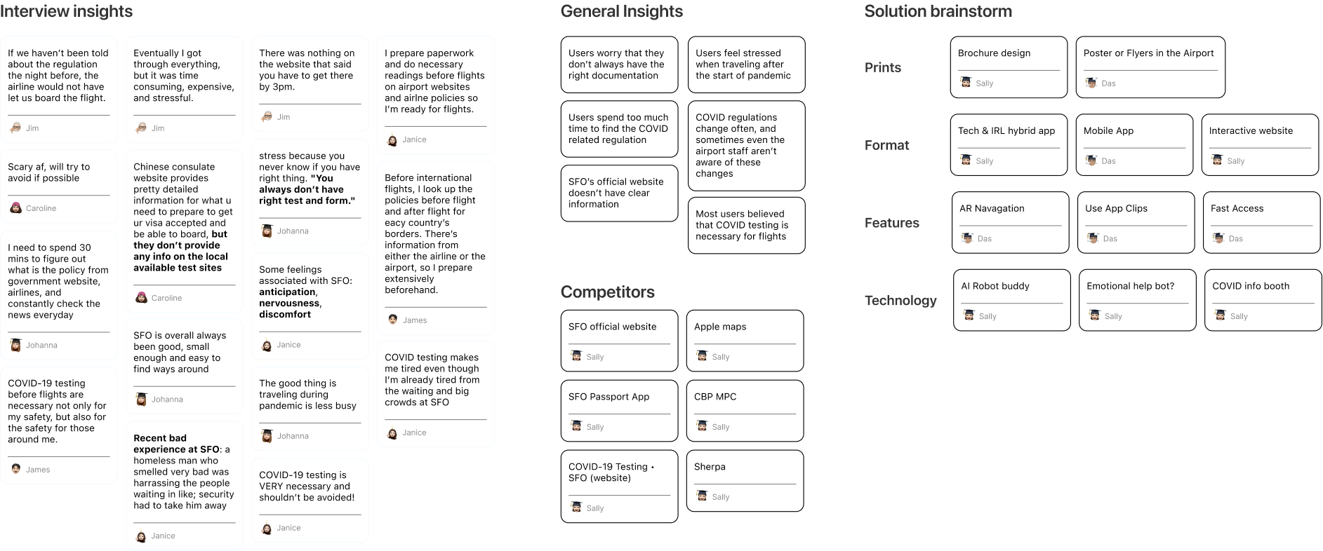
User Interview
Instead of going into this project with a problem in mind to solve, we decided to interview people who have previously utilized SFO to narrow down the problem space.
Our interviewees varied lots, from age ranges, occupations, times travelled per year, and more.
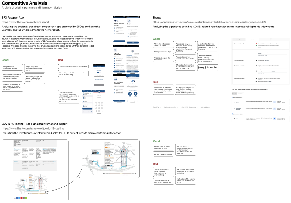
Competitive Analysis
Competitive Analysis helped us not only identify what features will be included in our final product, but also conduct a simple heuristic evaluation of the features included in each product analyzed.
Ideation & Synthesis
After the user research process, we gathered our findings and ideated potential solutions for the problem. Learn about that process here!
HMW Statement
We narrowed and defined the problem space as we moved on with our research.
How might we reimagine the passenger experience for traveling via airplane during COVID so that it would be easy to find testing facilities and reduce the stress for travelers before their flight?
Affinity Mapping
We categorized our ideas, brainstormed solutions for the identified problem, and voted on which idea to continue the project.
Solution
Here are some highlights of the solution that focused on making the app as accessible and intuitive as possible for the users.
App Clips
We chose to use App Clips because it allows users to perform the task without downloading any apps.
Linear User Interface
We designed a linear interface to ensure the best user experience based on what we learned from Apple Human Interface Guidelines.
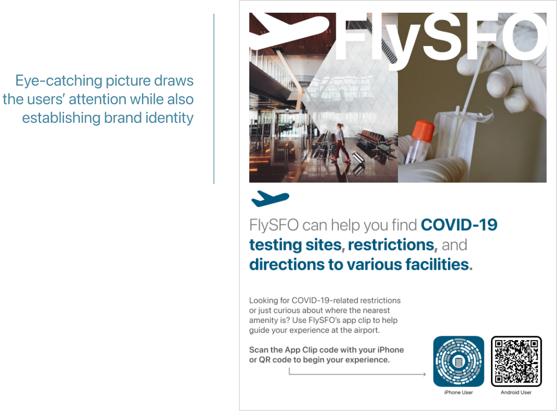
Poster
With the help of posters and map integration, App Clips will be even more accessible.
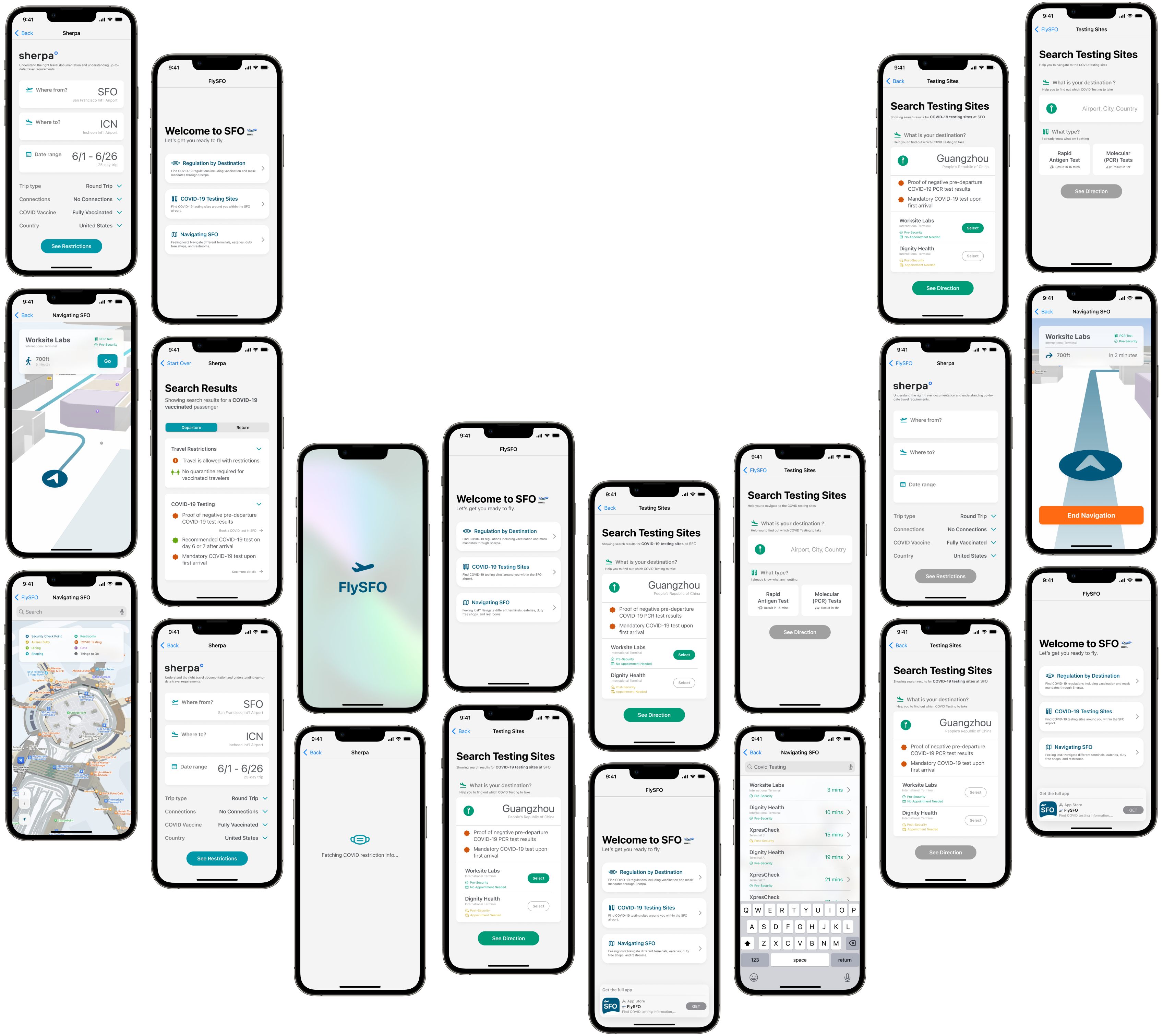
Prototyping
See how FlySFO came to life through multiple iterations, user insights, and more in this section.
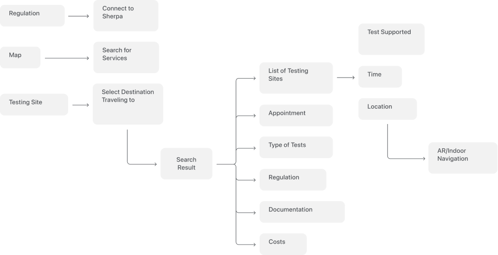
Task Flow
To ensuring the flow to be as simple and intuitive as possible for the users, I created task flows based on our research and App Clip design guidelines before we kick off the the visual design.
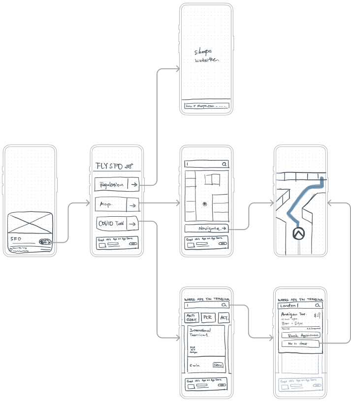
Rapid Prototype
We turned our brainstormed ideas into reality on paper through quick sketches. Through these sketches we could decide or discard ideas with no strings attached!
Usability Test
Usability testing and constant feedback from the people we're designing for ensured that our design process and the result was truly human-centered.
Goals
Is the flow intuitive and accessible?
Are there misleading information in the copywriting that could be fiexed?
How likely is it for users to use there features on the flow at SFO?
Takeaways
Include QR code or a way for non-iPhone users to navigate the app.
Change the order of items in the home page.
“'Where to?' is a little confusing to me. Do you mean to my desitnation or to the testing site?”
Access the app via Posters, Website, and Apple Maps
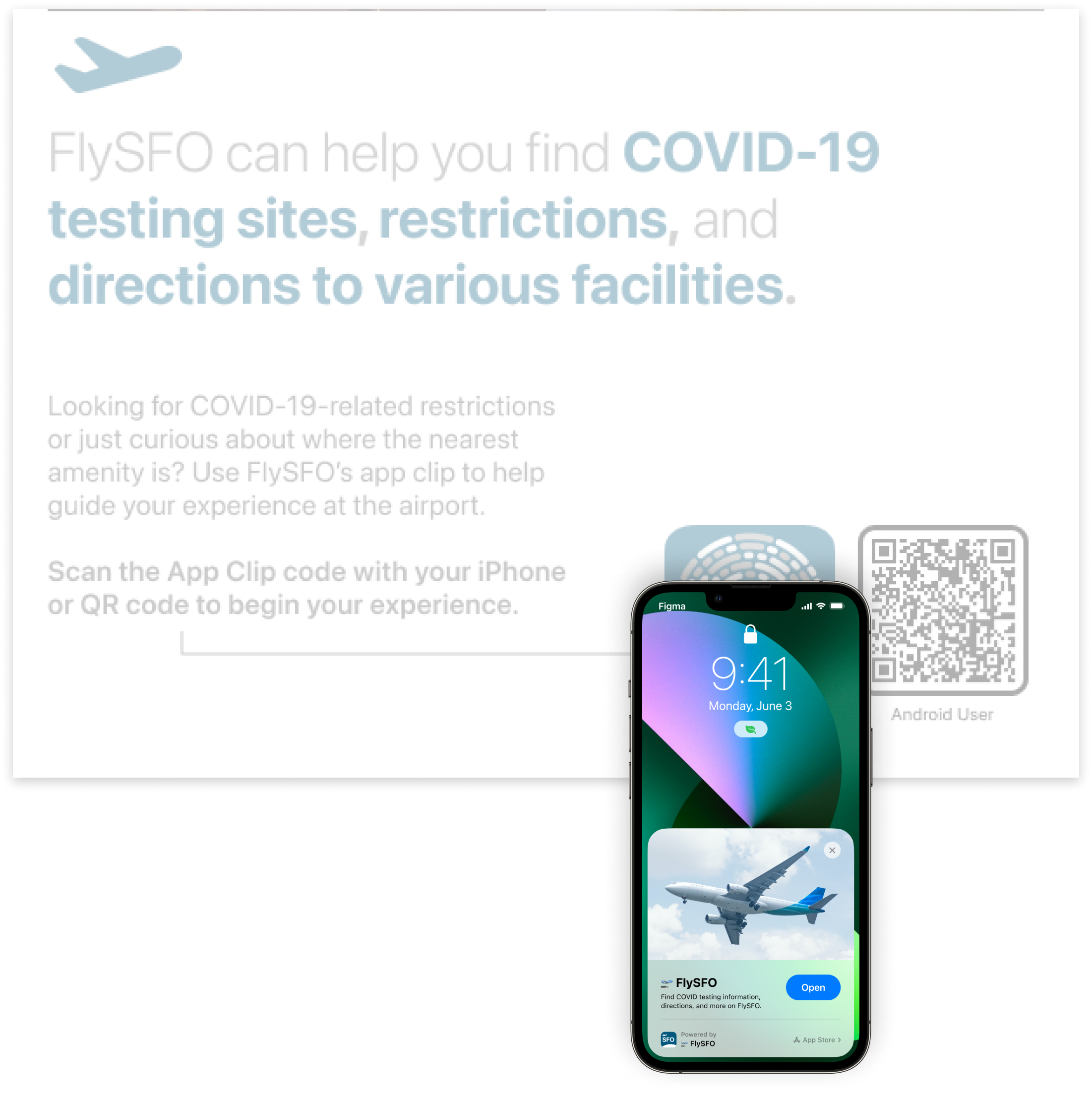
We designed a poster that contains App Clip Code and QR code. Each App Clip Code is unique and contains the location of where it is presented. Ultimately, this poster is designed to help users navigating SFO to easily access COVID testing-related help through a simple interaction.
Entering the app via Posters
For Apple users, the App Clip Card will pop up after scanning the QR Code or tapping on the NFC Tag; Android users can scan the QR code to open the web experience.
Entering the app
via Website
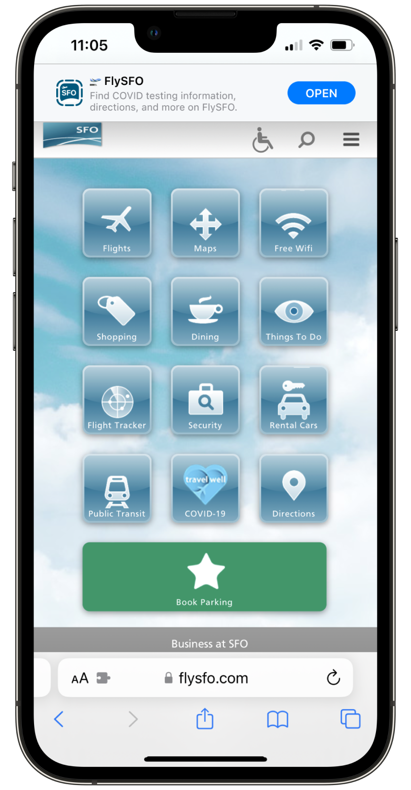
Many users use the website to plan their trip, iPhone users can use Smart App Banners on flysfo.com to access the App Clips.
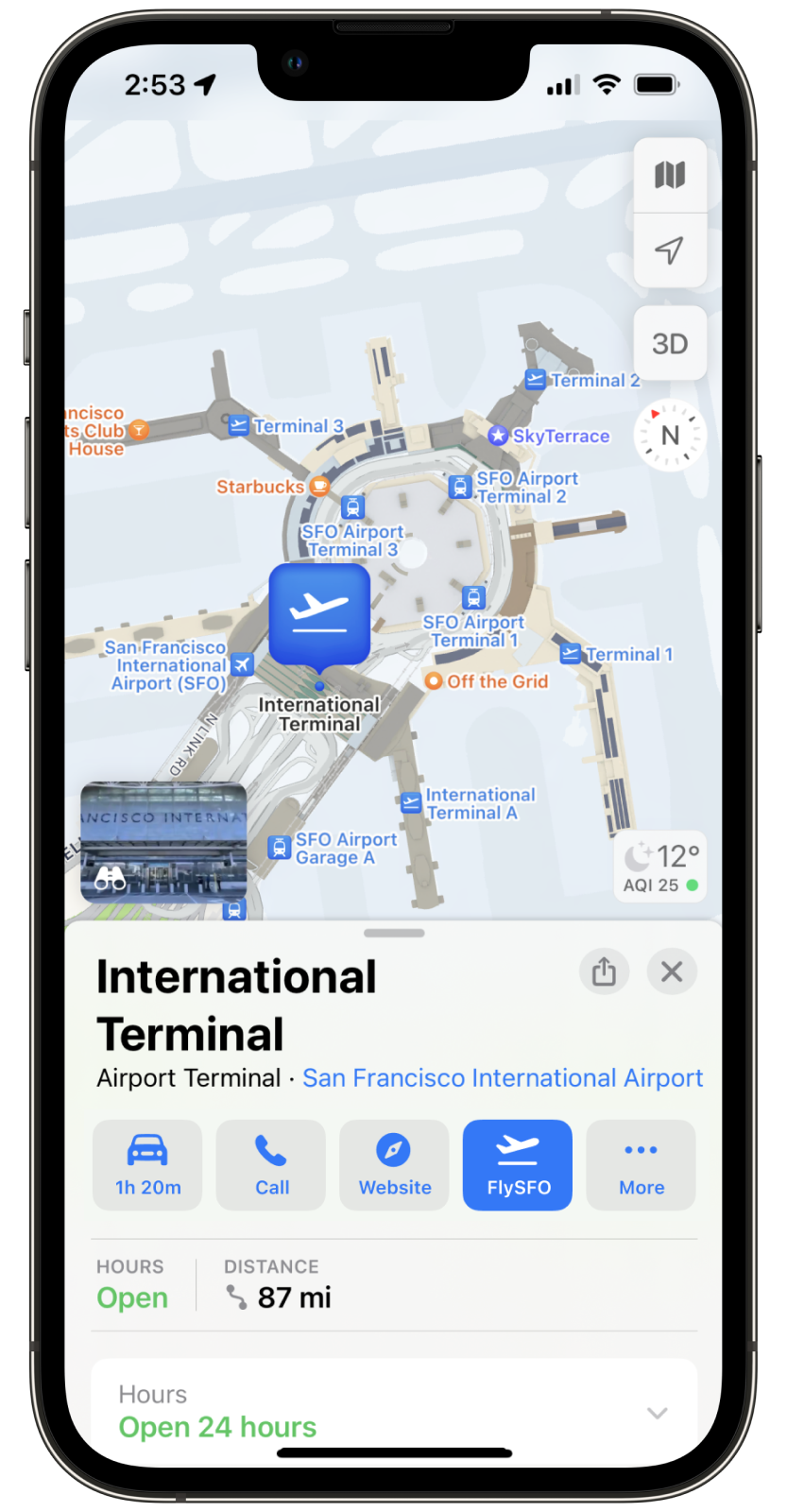
Entering the app
via Apple Maps
When iPhone users search SFO in the Maps, users can click the FlySFO button to access the App Clips.
Home,
The Navigation!
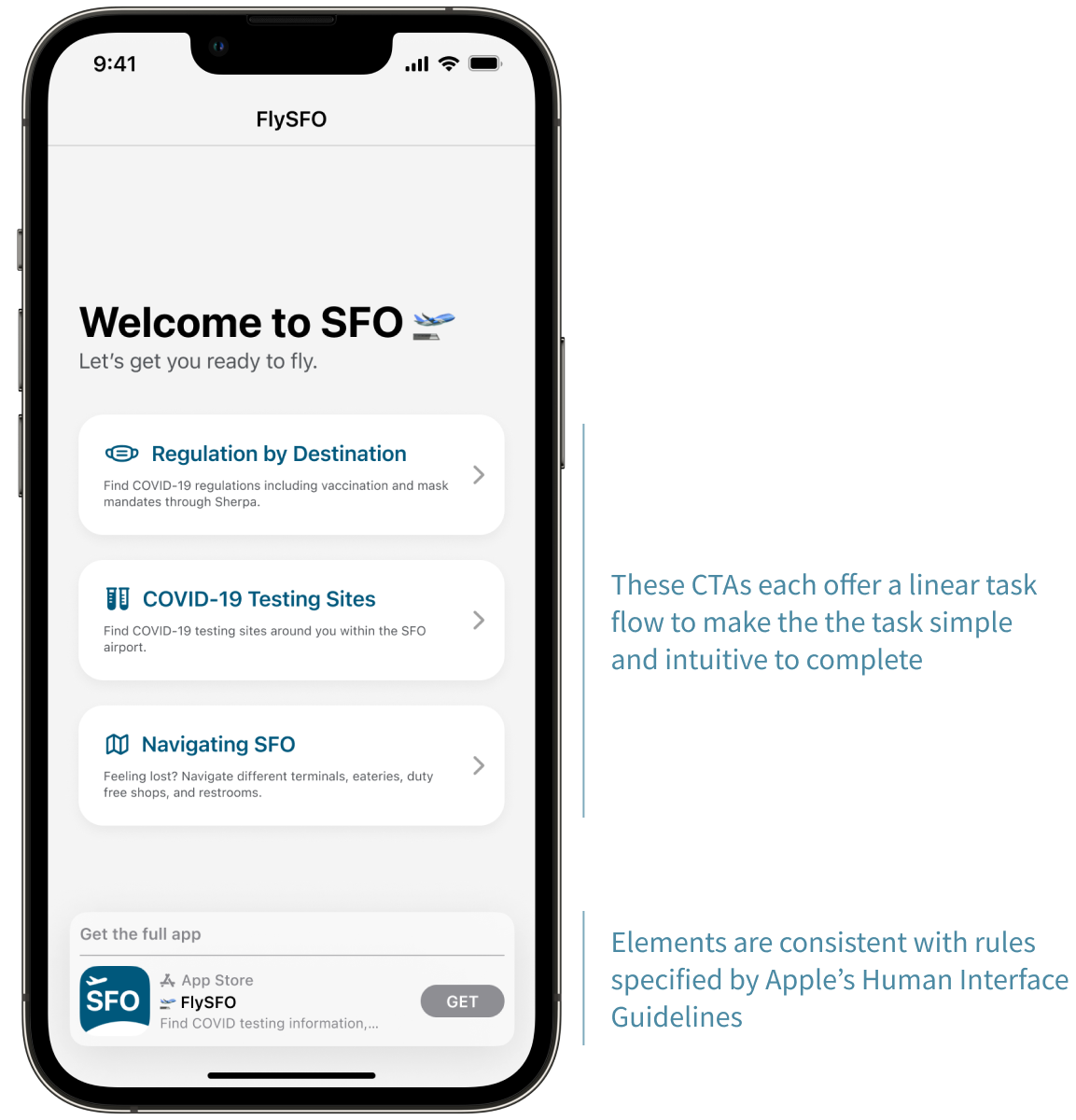
Finding Travel Regulation Rules
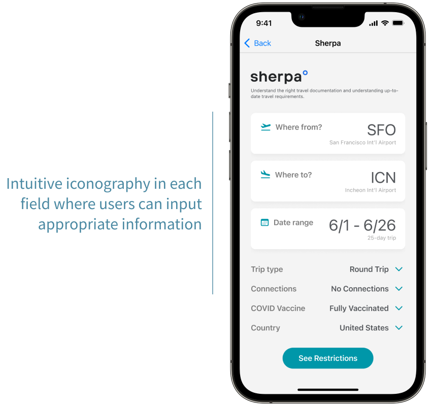
FlySFO connects to Sherpa, through which the user will receive details on travel regulation, including COVID restrictions and policy, depending on their arrival location.
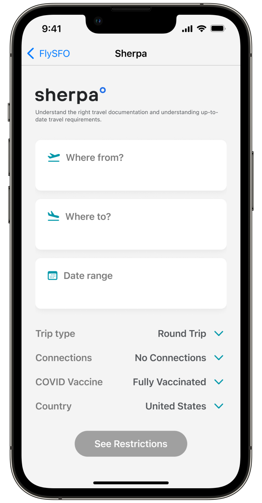
View regulations for both departure & return
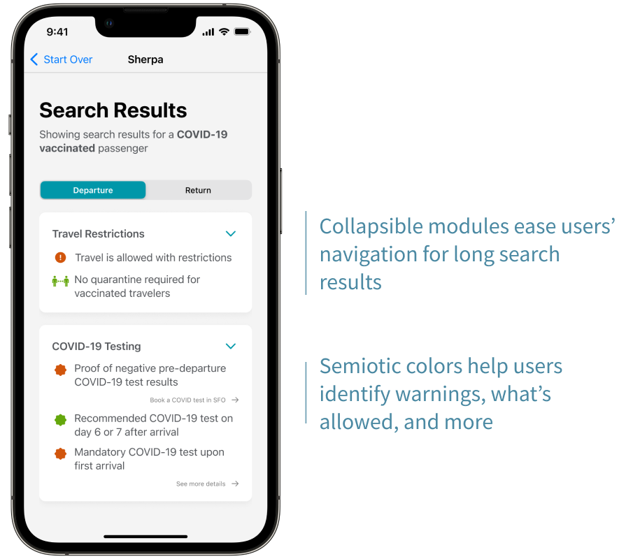
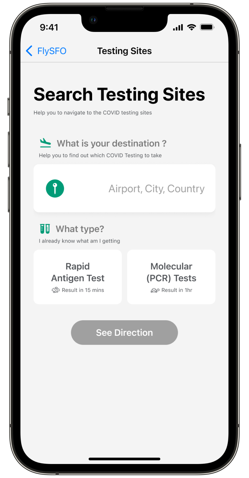
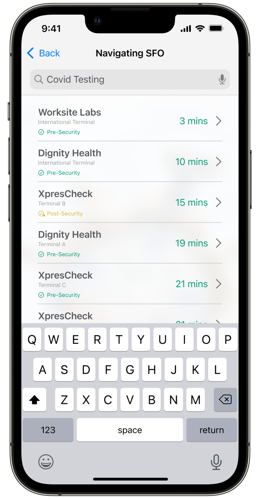
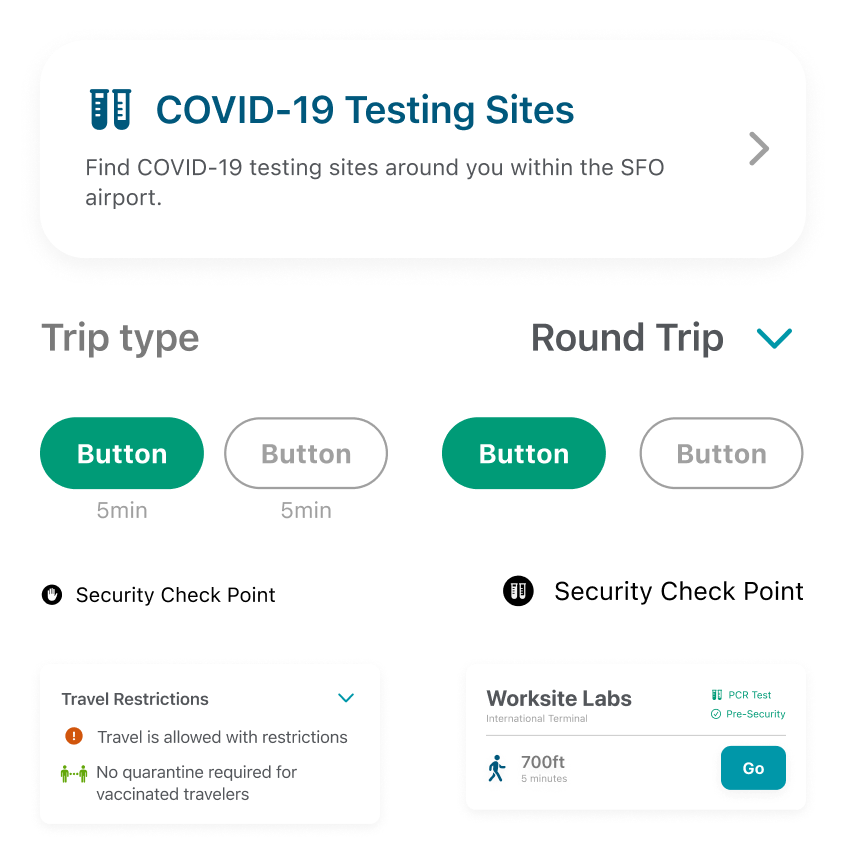
Searching for COVID-19 testing sites
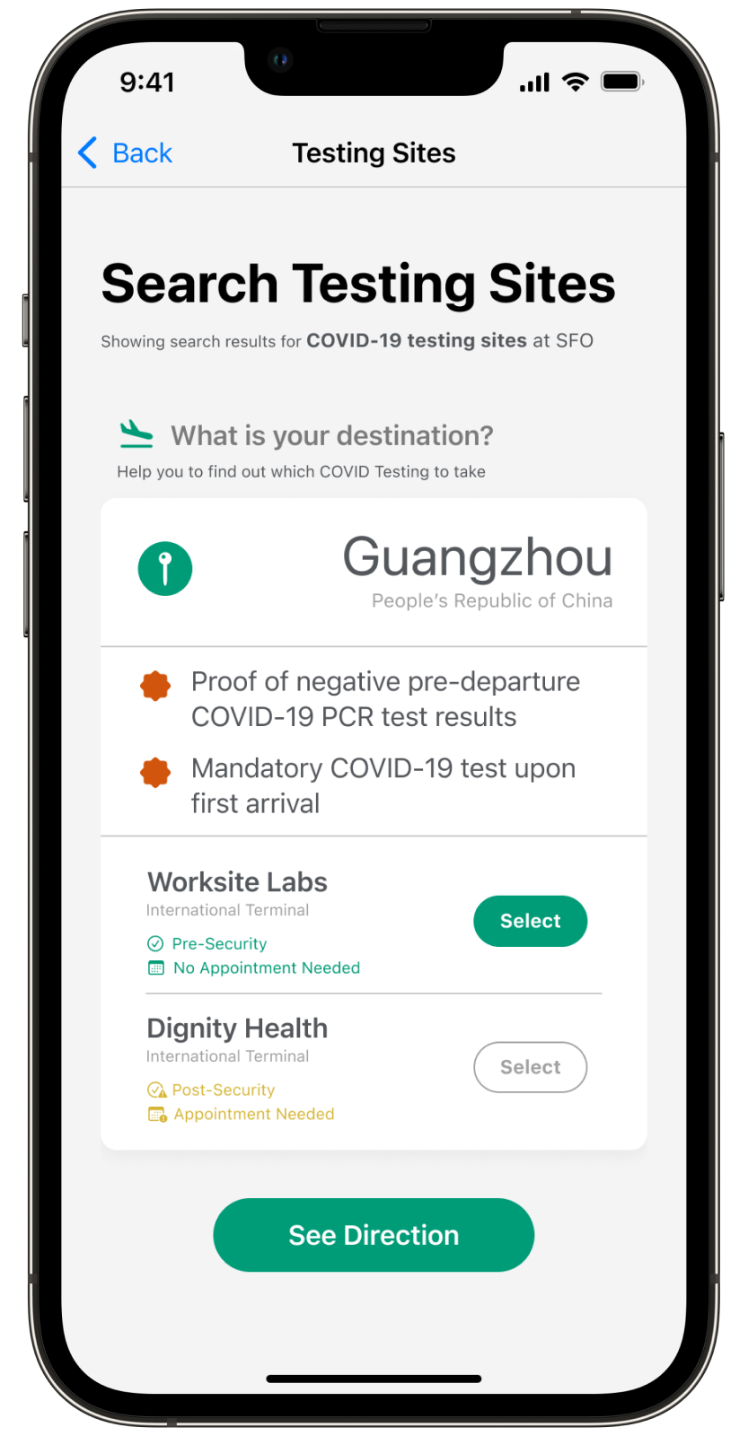
If users don’t know what type of test is needed to enter their country of destination, they can simply type in the their destination. The regulation and testing site information will be presented to the user, and they can easily navigate to the testing sites.
If users know what type of test they need, they can choose the test type and navigate to the site from the list of testing sites that is provided to them.
The destination input box expands as users input their desitinations to show COVID regulations, type of test they need to take and testing site information.
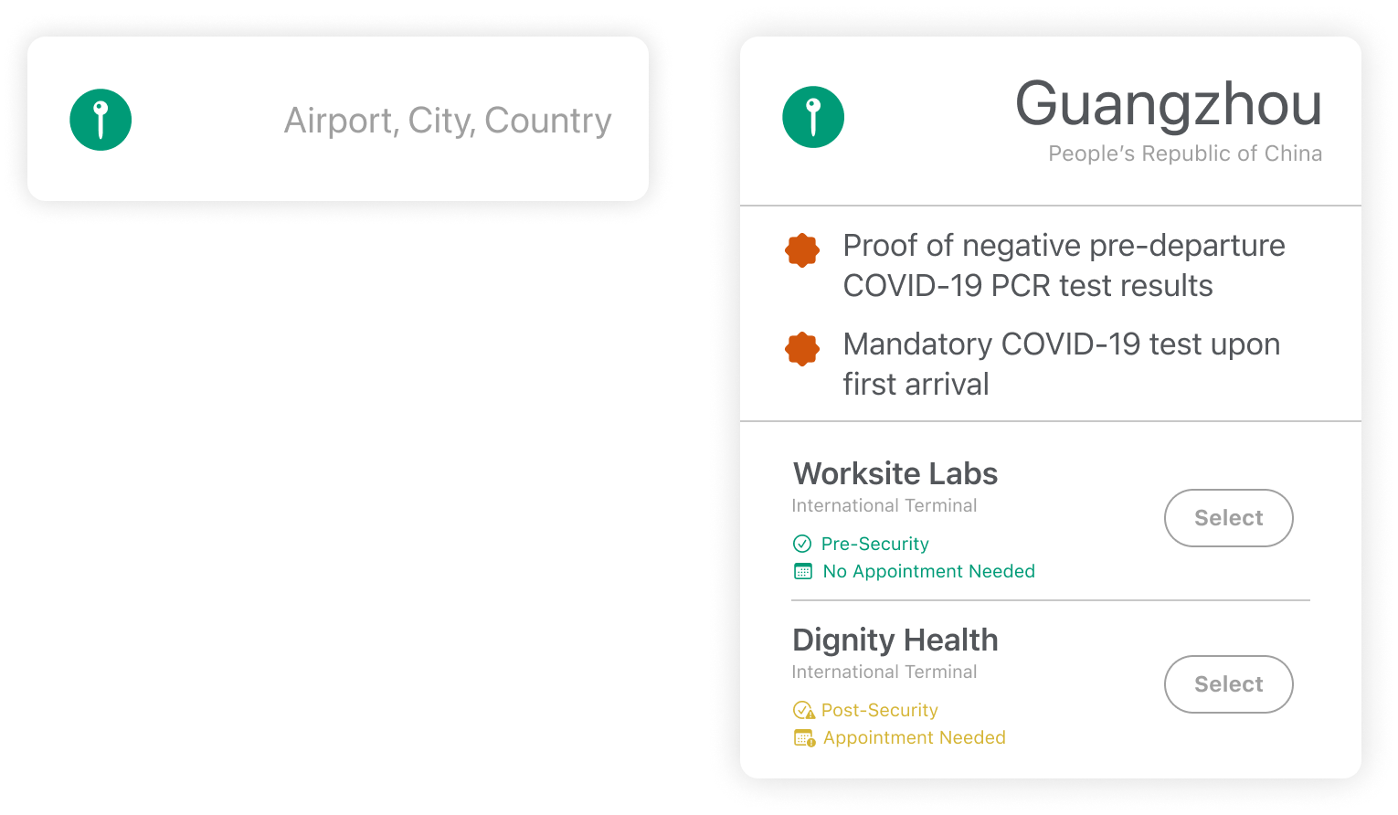
The colored icon brings users' attention to actionable mandates, COVID regulations and informs users of the type of test they need for traveling to their destinations.
Test locations, appointment requirement, and whether users need to pass a security checkpoint are included in each testing sites information section. Users can select a nearby testing site within SFO for easy navigation.
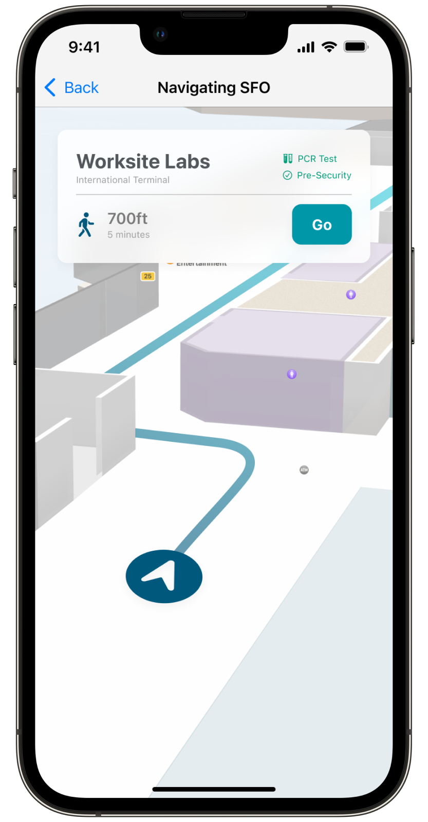
Navigating to
the testing site
The Navigation Info Card provides the distance from the user’s location, and the time it takes to get there, as well as lcoation, test type, and security checkpoint requirement of the testing site. Users can click the “Go” button to start the navigation.
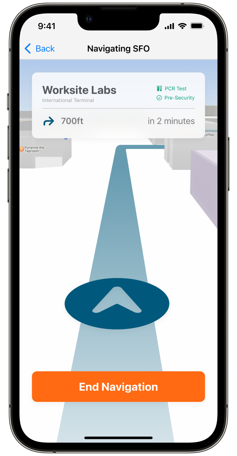
Interactive indoor navigation where surrounding environment can be seen makes finding directions incredibly easy, even for first-time users.
Navigating around the airport
User can use the App Clip to navigate all types of services at SFO using the search feature and universal icon indicators.
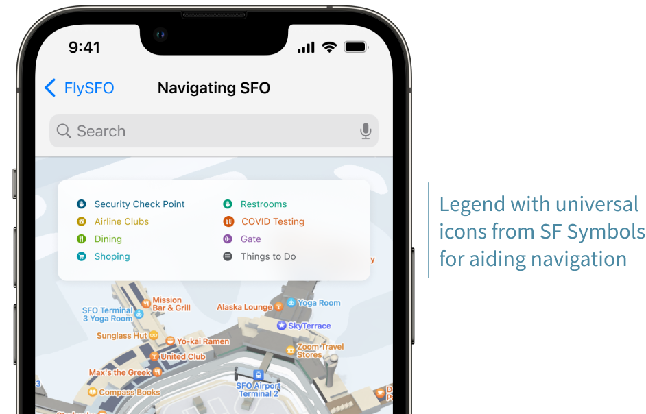
The Smart Search feature does not require users to type the exact name of the place they want to navigate to.
Design System
To ensure consistency across the screens in the hi-fidelity design, we agreed on some rules and guidelines, and gathered them. This way, we incorporated our styles into the preexisting color guidelines set by SFO and the Human Interface Guidelines set by Apple.
Typography

Color Palette
The color palette we used are the same colors found in SFO’s branding guidelines. We decided to use the preexisting color palette to show that this app is designed for SFO and its users.

Components
We also created components that show up multiple times in the product to ensure consistency.
App Icon
We studied not only SFO's current branding and guidelines, but also Apple's design style to ensure that the prototype and design looks professional and on-par with SFO's other digital products.
Final Thoughts & Future Steps
Of course, not everything went as we planned. Here are some of our final thoughts and what’s next for FlySFO.
Determining the scope of any project can save time during the design process and help visualize what's possible and what's not possible to create within the given timespan.
It's important to learn & adapt to design guidelines and styles if you design an extension of an already existing brand identity.
Collaboration sparks new ideas, and bring in valueable perspectives!
What's Next?
Consider different ways to distribute the poster that incites the users to scan the App Clip code
Revise copywriting within the app itself to make the overall experience the most intuitive for first-time users
Add a “Travel Summary” section within the travel restriction report: a tl;dr statement for busy, on-the-go passengers
Talk to people and personnel at SFO to gain more insights and details